CSS Customization
DataGrail Consent has extensive customization options, so you can match the banner user interface to your web app's branding and design system.
Within the DataGrail App, you can construct unique layouts that, in turn, have different layers that appear to Data Subjects with varying levels of detail with regards to their privacy rights and the actions they can take.
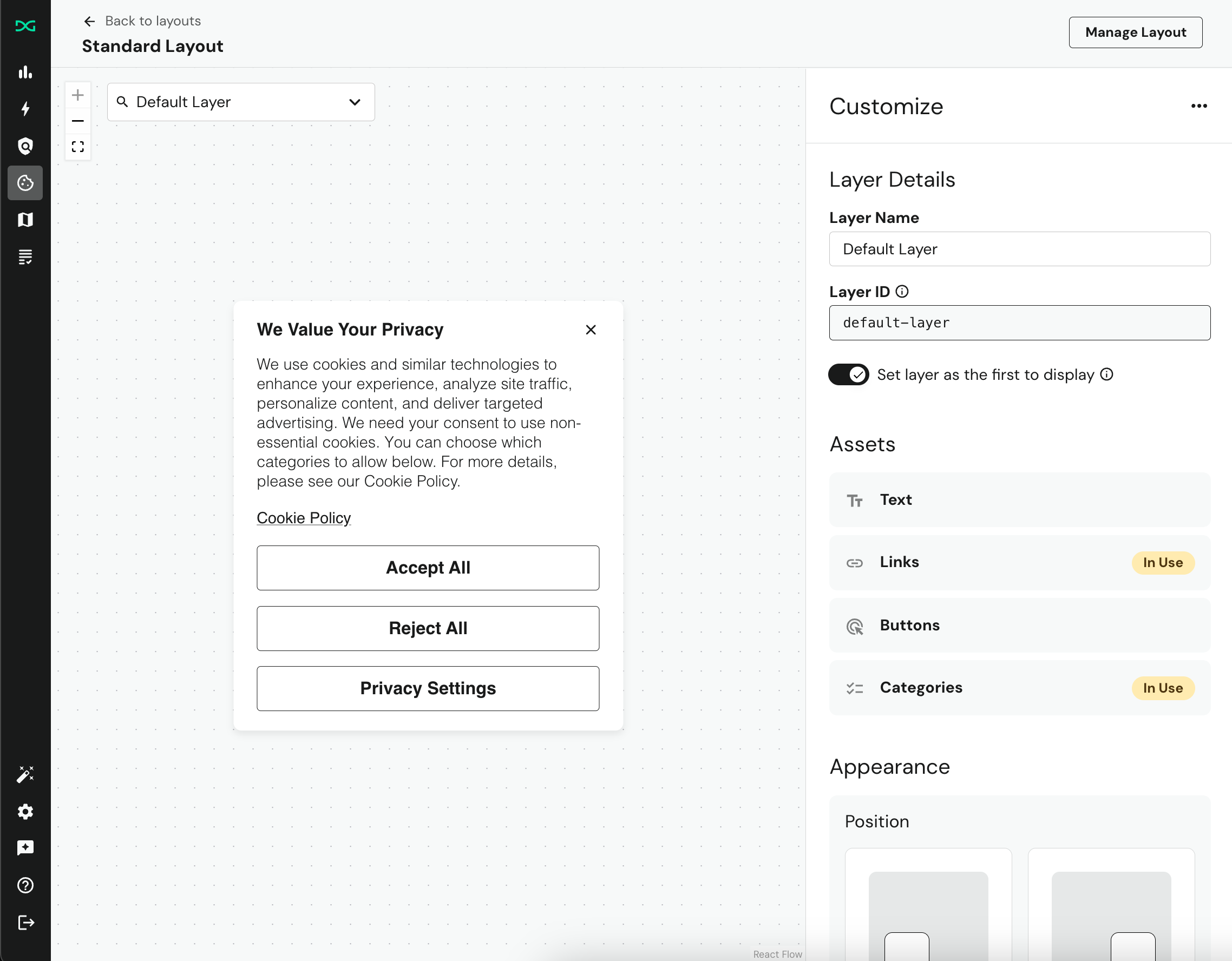
For customers that want to have more control over their banner layout and layer appearances, you can follow this guide to set up your layout to accept custom styles.
Creating the <style> element
DataGrail's Consent Banner is rendered using the Shadow DOM. This helps to encapsulate the elements and prevent any JavaScript and CSS on the page from inadvertently affecting its style or functionality. Due to this encapsulation, <link> elements that point to external stylesheets will have no effect on the banner style.
Instead, we provide two options for injecting your CSS and styling the banner:
- Add
<style>element via Google Tag Manager (GTM) - Add
<style>element directly to the<head>of your page
Because we are rendering the Banner using the Shadow DOM, you MUST prepend your CSS selectors with :host(.dg-consent-banner) in order for your styling to be applied.
Google Tag Manager
To implement custom CSS via Google Tag Manager:
- In the same GTM container as your DataGrail Consent Banner, add a new Custom HTML tag.
- This tag should contain a single
<style>element, withid='dg-consent-custom-style'. This allows our consent banner to recognize and apply these styles to the correct elements.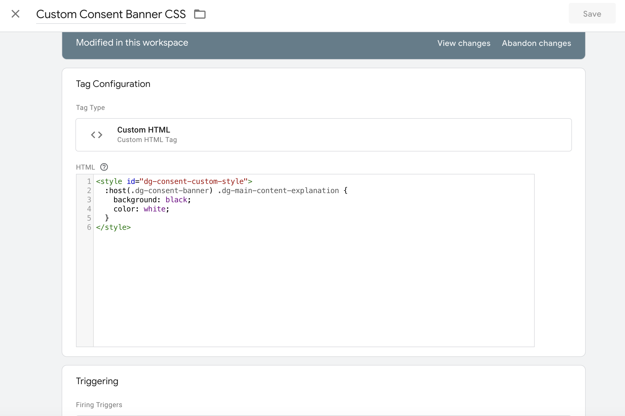
- Set the firing trigger to all pages. After saving this Custom HTML tag, you can preview the CSS before publishing by using GTM's Preview functionality.
- When you're happy with this CSS, go ahead and publish your changes.
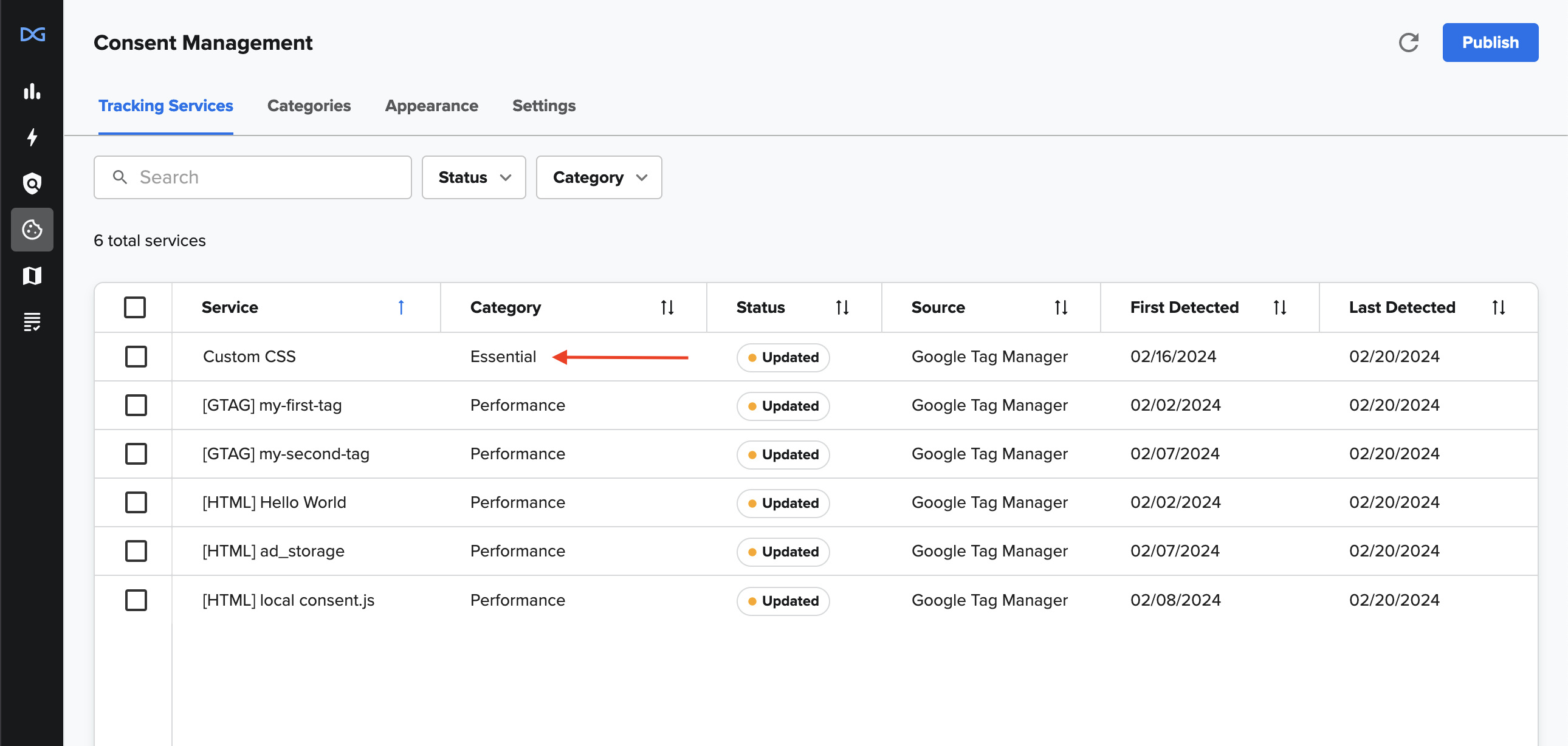
- In DataGrail, sync your tags and then assign the "Essential" category to this new tag. This ensures your custom styles are always injected into the page.
Static HTML
To implement custom CSS as static HTML:
- Write your custom CSS inside a
<style>tag with the sameidattribute as the GTM example above. - Place this directly within the
<head>section of your HTML document.
This method works best for users with direct access to their site’s HTML. Note that some environments don’t support previewing HTML edits before publishing, which can make testing changes more challenging
We recommend having a staging site and associated GTM environment for preview purposes.
HTML and Selector Overview
Throughout this guide we will be using the !important flag to illustrate changes to the styling in shorthand.
It is best practice for CSS to develop CSS priority with specificity rather than using the !important tag, so we encourage developers to use whatever method they feel fits their specific needs.
CSS Variables
We have provided a number of semantically named variables with the intent of simplifying common changes. Benefits of using the variables to effect change include having the full confidence that the overall styling will not be affected.
Variables can be overwritten by wrapping them in the host container.
:host(.dg-consent-banner) {
  --dg-button-border: blue 5px solid;
}
General
These are variables that affect the entirety of the banner.
--dg-primary-font: Determines the font for the application at large.
--dg-secondary-font: Determines the font for "secondary" contents.
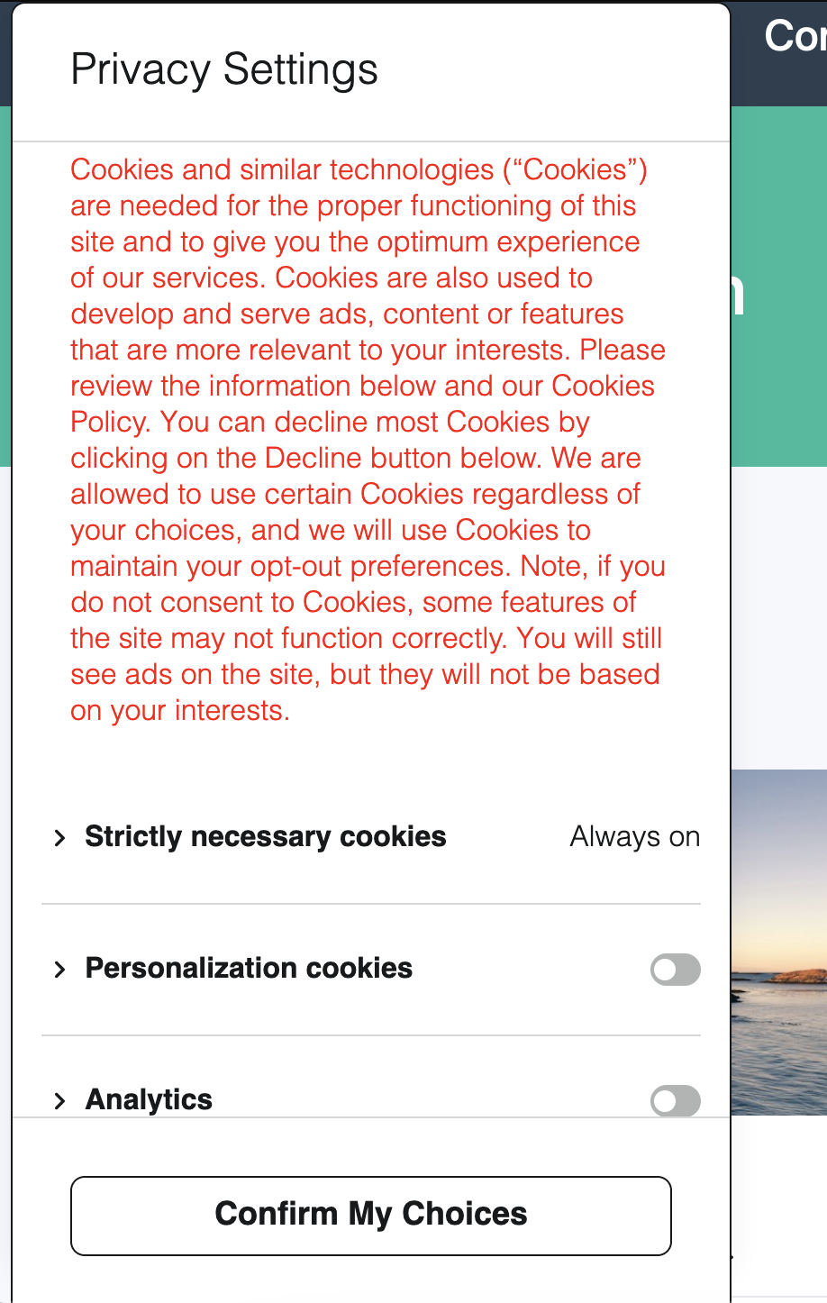
--dg-consent-background-color: Determines the color of the background of the banner (excluding buttons and the policy categories).
--dg-consent-background-border: Determines the border of the banner.
--consent-border-radius: Determines the radius for the borders of the banner.
:host(.dg-consent-banner) {
  --dg-consent-background-color: gray;
}
Body
These variables affect "Body" style text elements.
--dg-body-font-size: Determines the font size.
--dg-body-font-weight: Determines the font weight.
--dg-body-font-color: Determines the font color.
--dg-body-line-height: Determines the line height.
:host(.dg-consent-banner) {
  --dg-body-font-color: red;
}
Heading
These variables affect "Heading" style text elements.
--dg-heading-font-size: Determines the font size.
--dg-heading-font-weight: Determines the font weight.
--dg-heading-font-color: Determines the font color.
--dg-heading-line-height: Determines the line height.
:host(.dg-consent-banner) {
  --dg-heading-font-color: red;
}
Title
These variables affect "Title" style text elements.
--dg-title-font-size: Determines the font size.
--dg-title-font-weight: Determines the font weight.
--dg-title-font-color: Determines the font color.
--dg-title-line-height: Determines the line height.
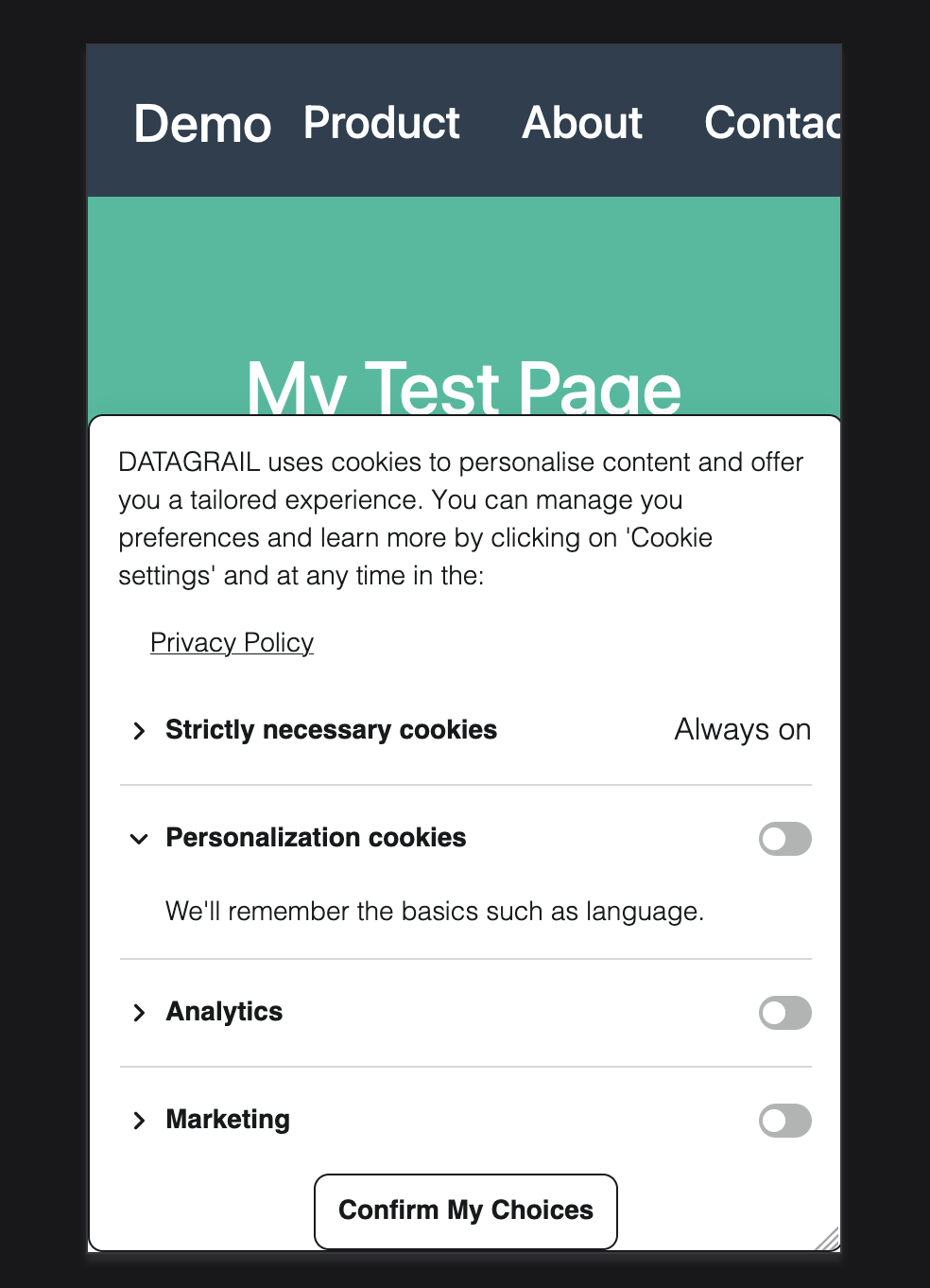
Category Title
This is a collection of variables that affect the content of the .dg-main-content-policy-option-heading container.
--dg-policy-option-heading-size: Determines the font size.
--dg-policy-option-heading-weight: Determines the font weight.
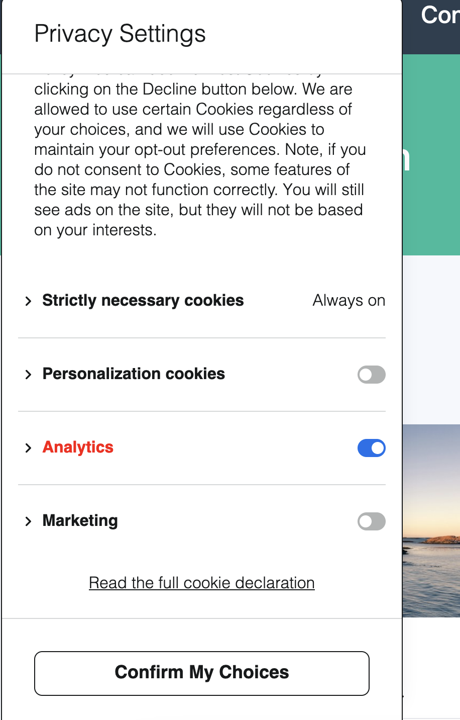
--dg-policy-option-heading-enabled-color: Determines the color of the heading if the category has been selected.
--dg-policy-option-heading-color: Determines the color of the heading overall.
--dg-policy-option-chevron-size: Determines the size of the Chevron beside the heading, it takes a numerical value, with the default being 20.
:host(.dg-consent-banner) {
  --dg-policy-option-heading-enabled-color: red;
}
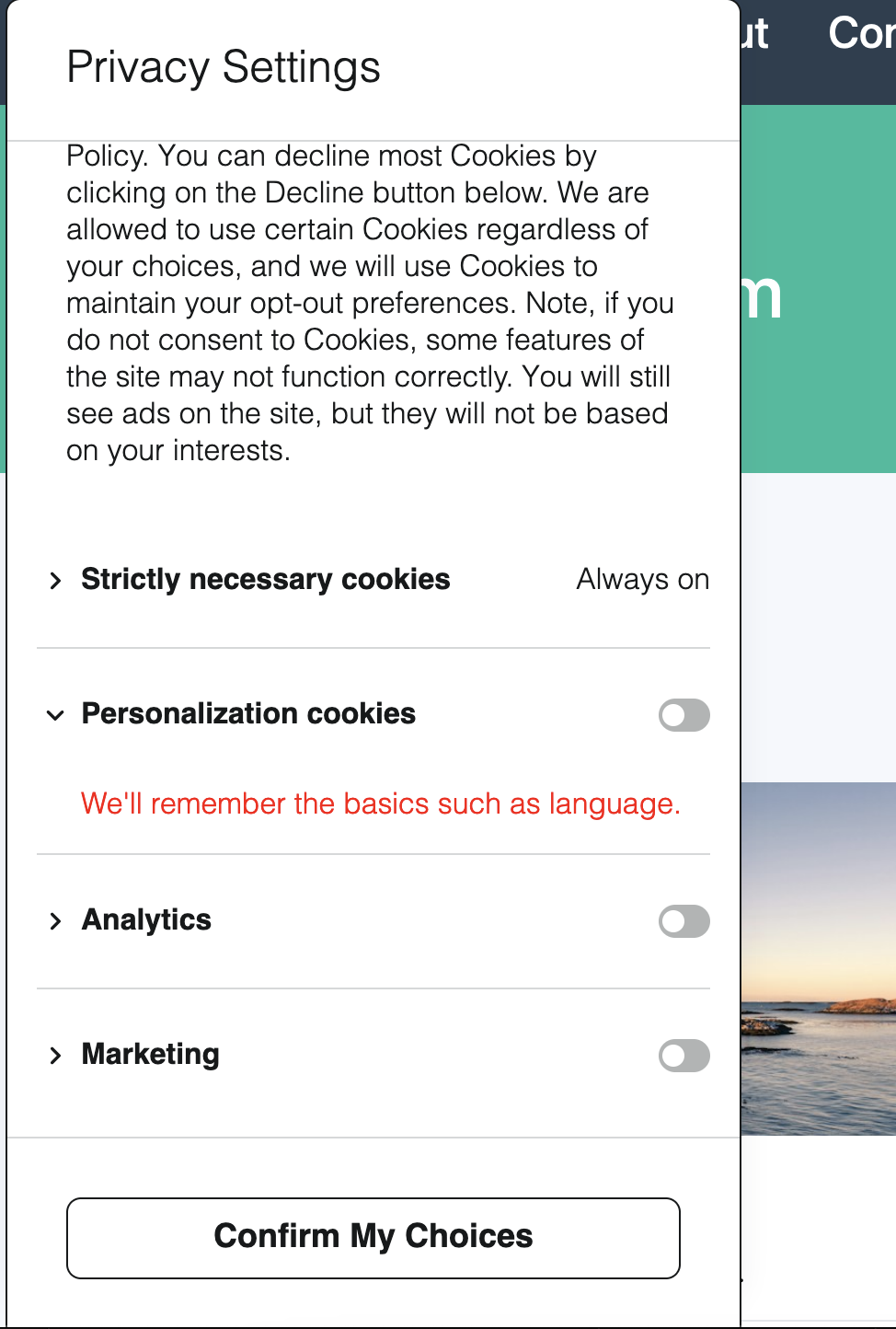
Category Description
This is a collection of variables that affect the content of the .dg-main-content-policy-option-description container.
--dg-policy-option-description-font-size: Determines the font size.
--dg-policy-option-description-font-weight: Determines the font weight.
--dg-policy-option-description-font-color: Determines the font color.
:host(.dg-consent-banner) {
  --dg-policy-option-description-font-color: red;
}
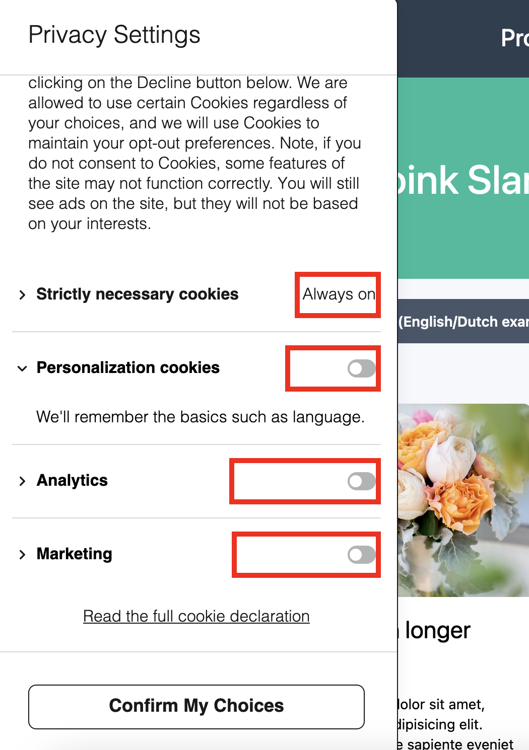
Essential Categories
This is a collection of variables that essential categories - specifically, the text that replaces the input sliders in the headings.
--dg-policy-option-essential-label-font-size: Determines the font size.
--dg-policy-option-essential-label-font-weight: Determines the font weight.
--dg-policy-option-essential-label-font-color: Determines the font color.
:host(.dg-consent-banner) {
  --dg-policy-option-essential-label-font-color: red;
}
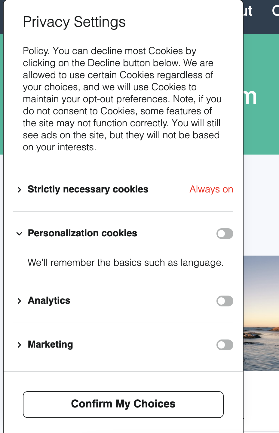
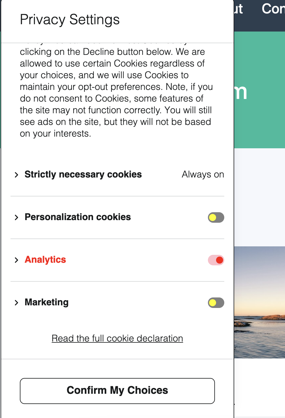
Category Sliders
This is a collection of variables that affect the content of the .dg-main-content-policy-option-input container.
--dg-slider-primary: Determines the foreground color for categories that are not enabled.
--dg-slider-secondary: Determines the foreground color for categories that are not enabled.
--dg-slider-enabled-primary: Determines the background color for categories that are enabled.
--dg-slider-enabled-secondary: Determines the foreground color for categories that are enabled.
:host(.dg-consent-banner) {
  --dg-slider-primary: yellow;
  --dg-slider-secondary: grey;

  --dg-slider-enabled-primary: red;
  --dg-slider-enabled-secondary: pink;

  /* For Enabled Categories */
  --dg-policy-option-heading-enabled-color: red;
}
Buttons
This is a collection of variables that affect the content of the .dg-button container.
--dg-button-font-size: Determines the font size.
--dg-button-font-weight: Determines the font weight.
--dg-button-color: Determines the font color.
--dg-button-background: Determines the background color.
--dg-button-border: Determines the border.
--dg-button-radius: Determines the border radius.
:host(.dg-consent-banner) {
  --dg-button-color: blue;
  --dg-button-background: skyblue;
  --dg-button-border: none;
  --dg-button-radius: 0;
}
HTML Selectors
DataGrail's layout editor allows elements to be positioned in any order and on any layer. The HTML structure of the Consent Banner is therefore flexible and will depend on your specific configuration.
However, there are a few key elements (and CSS class names) that are present in every configuration, as detailed below.
.dg-consent-banner
.dg-consent-banner is the root element that contains the Consent Banner. It is used to set the outer bounds of the app container, often in conjunction with .dg-app.
.dg-app [FLEX container]
dg-app is the container which positions the Consent Banner. It is also a flex container, allowing the immediate contents some level of control over the direction and alignment of its immediate children.
:host(.dg-consent-banner) .dg-app {
  border: red 5px solid !important;
}
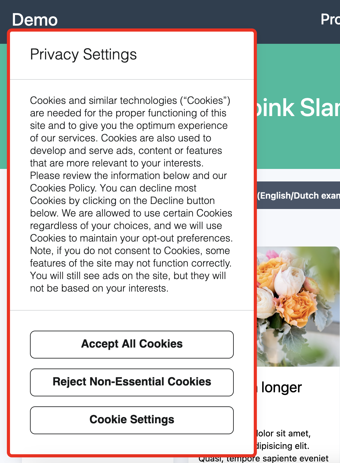
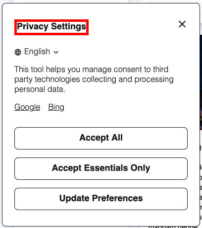
.dg-header
dg-header is the container which defines the heading of the application. It includes both the first element (assumed to be the banner title), and the "close" button, if configured.
:host(.dg-consent-banner) .dg-header {
  border: red 5px solid !important;
}
.dg-header-close
dg-header-close is the element containing the close icon, if the banner has been configured to have a close button. If it is not configured to have a close button, this element will not exist.
:host(.dg-consent-banner) .dg-header-close {
  border: red 2px solid !important;
}
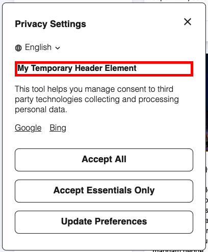
.dg-main-content-explanation
This class name may be updated in future to be simpler and more semantically correct, e.g. .dg-text
dg-main-content-explanation is the base class for all text elements.
:host(.dg-consent-banner) .dg-main-content-explanation {
  border: red 5px solid !important;
}
.dg-text-body
dg-text-body is the class applied to all text elements with "body" style.
:host(.dg-consent-banner) .dg-text-body {
  border: red 5px solid !important;
}
.dg-text-title
dg-text-title is the class applied to all text elements with "title" style.
:host(.dg-consent-banner) .dg-text-title {
  border: red 5px solid !important;
}
.dg-text-header
dg-text-header is the class applied to all text elements with "header" style.
:host(.dg-consent-banner) .dg-text-header {
  border: red 5px solid !important;
}
Rich Text Elements in Text Assets
Body text assets support rich text formatting. The following HTML elements can appear inside .dg-main-content-explanation and can be targeted with CSS selectors:
| Selector | Element |
|---|---|
.dg-main-content-explanation a | Hyperlinks |
.dg-main-content-explanation b, .dg-main-content-explanation strong | Bold text |
.dg-main-content-explanation i, .dg-main-content-explanation em | Italic text |
.dg-main-content-explanation u | Underlined text |
.dg-main-content-explanation p | Paragraphs |
.dg-main-content-explanation ul | Unordered (bulleted) lists |
.dg-main-content-explanation ol | Ordered (numbered) lists |
.dg-main-content-explanation li | List items |
By default, links inherit the text color and are underlined, and lists have 20px of left padding.
:host(.dg-consent-banner) .dg-main-content-explanation a {
  color: blue !important;
  text-decoration: none !important;
}

:host(.dg-consent-banner) .dg-main-content-explanation ul,
:host(.dg-consent-banner) .dg-main-content-explanation ol {
  padding-left: 32px !important;
}
Rich text formatting is only available for body text style. Title and header text styles render as plain text.
All HTML attributes except href on <a> tags are stripped from rich text content for security. This includes style, class, id, and event handler attributes. Use the CSS selectors documented above to style rich text elements.
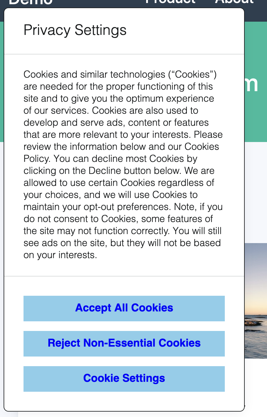
.dg-button
dg-button is the container for the user call to actions in the Consent Banner.
:host(.dg-consent-banner) .dg-button {
  border: red 5px solid !important;
}
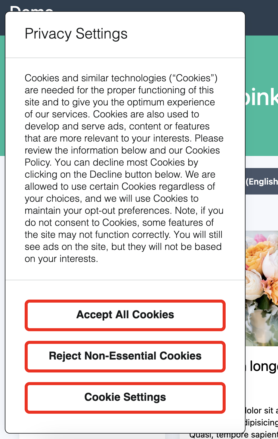
Styles can be applied to individual buttons, which use the following CSS Classes:
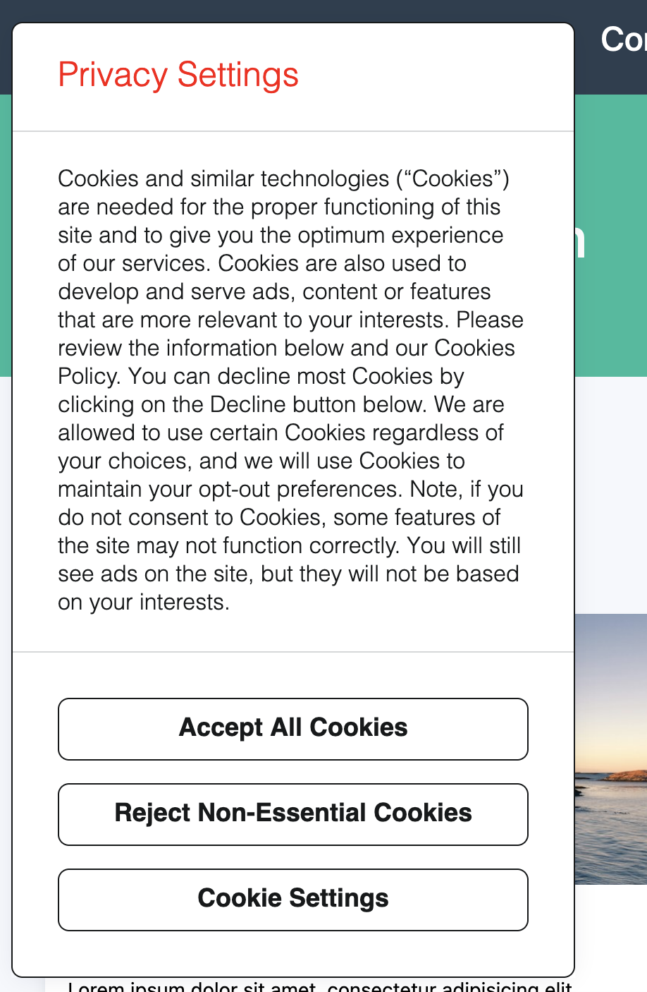
- Accept all:
accept_all - Reject all:
reject_all - Save custom choices:
custom - Accept one or more choices:
accept_some - Open layer:
open_layer
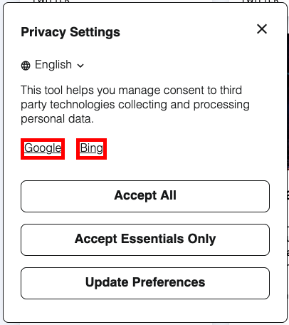
.dg-links
dg-links is the container element that holds all links, if links have been configured.
:host(.dg-consent-banner) .dg-links {
  border: red 5px solid !important;
}
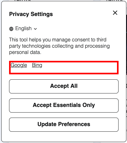
.dg-link
dg-link is the anchor element that holds each individual link, if links have been configured.
:host(.dg-consent-banner) .dg-link {
  border: red 5px solid !important;
}
.dg-main-content-policies
dg-main-content-container is the container for the cookie consent categories.
:host(.dg-consent-banner) .dg-main-content-policies {
  border: red 5px solid !important;
}
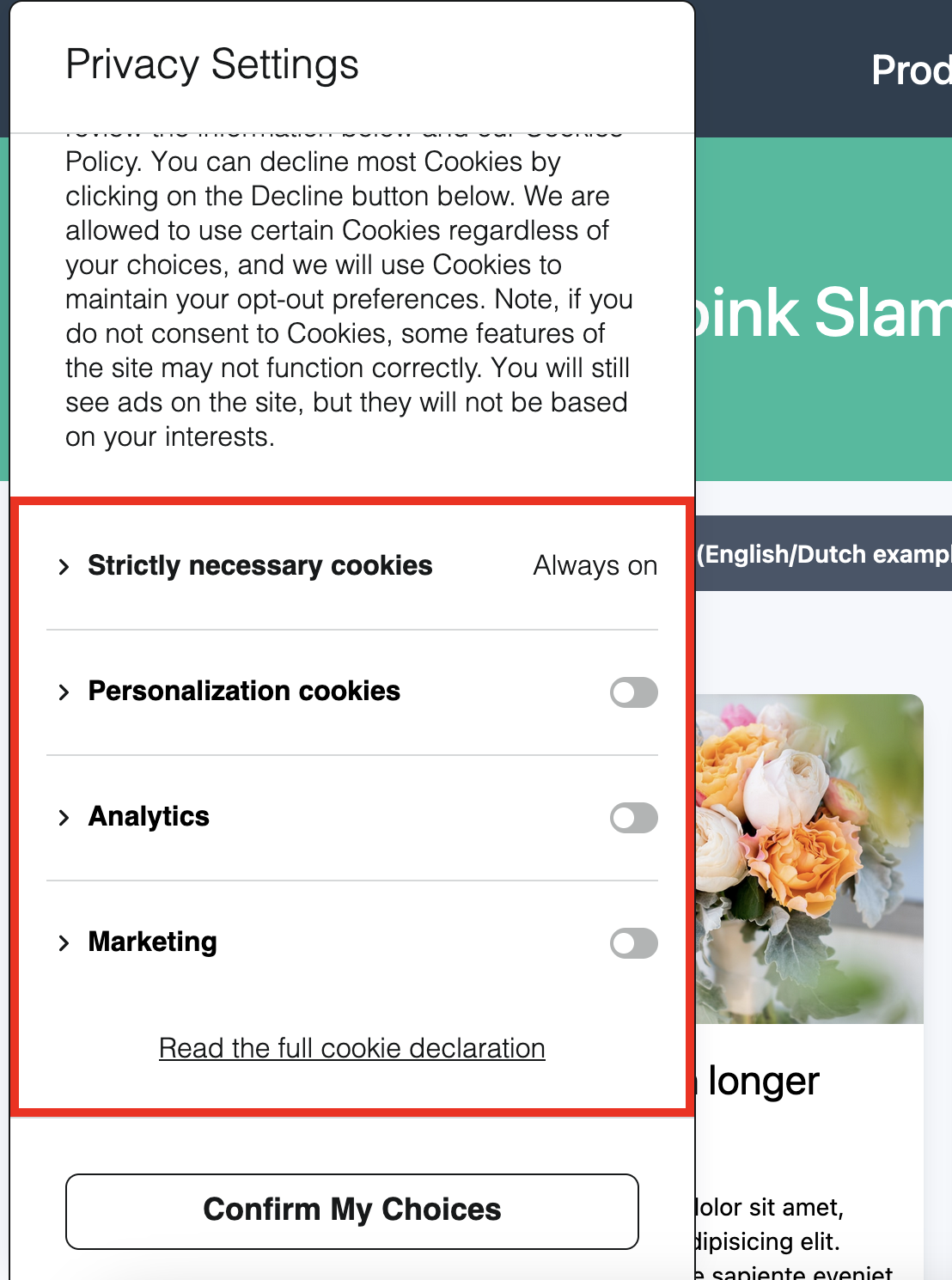
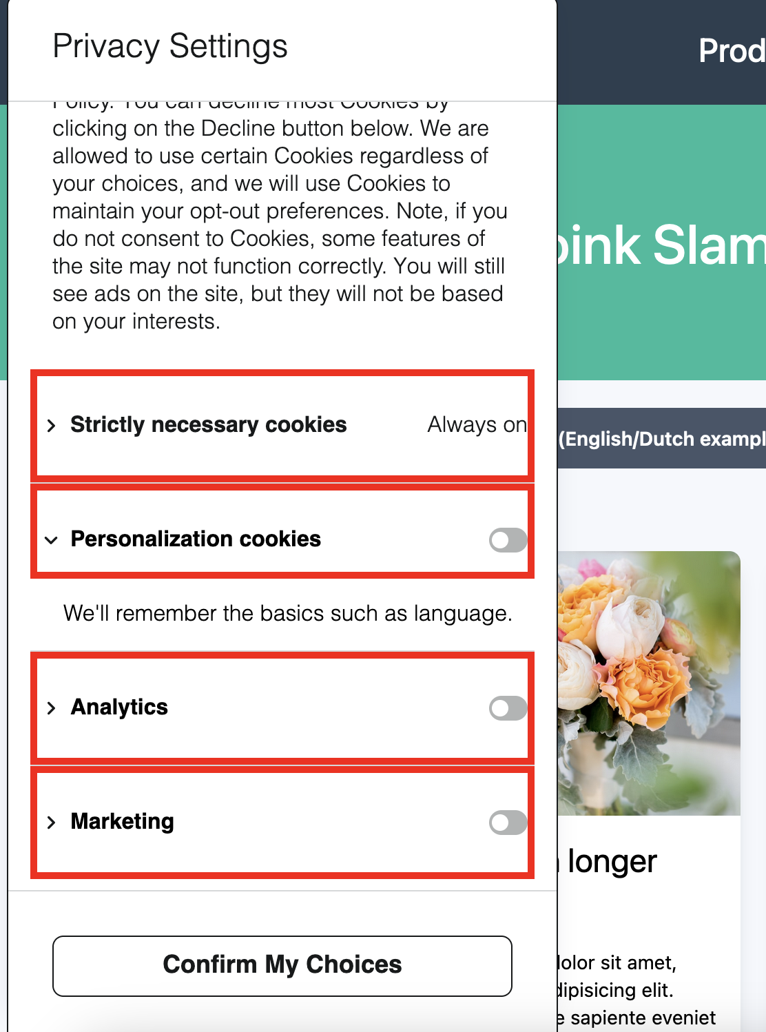
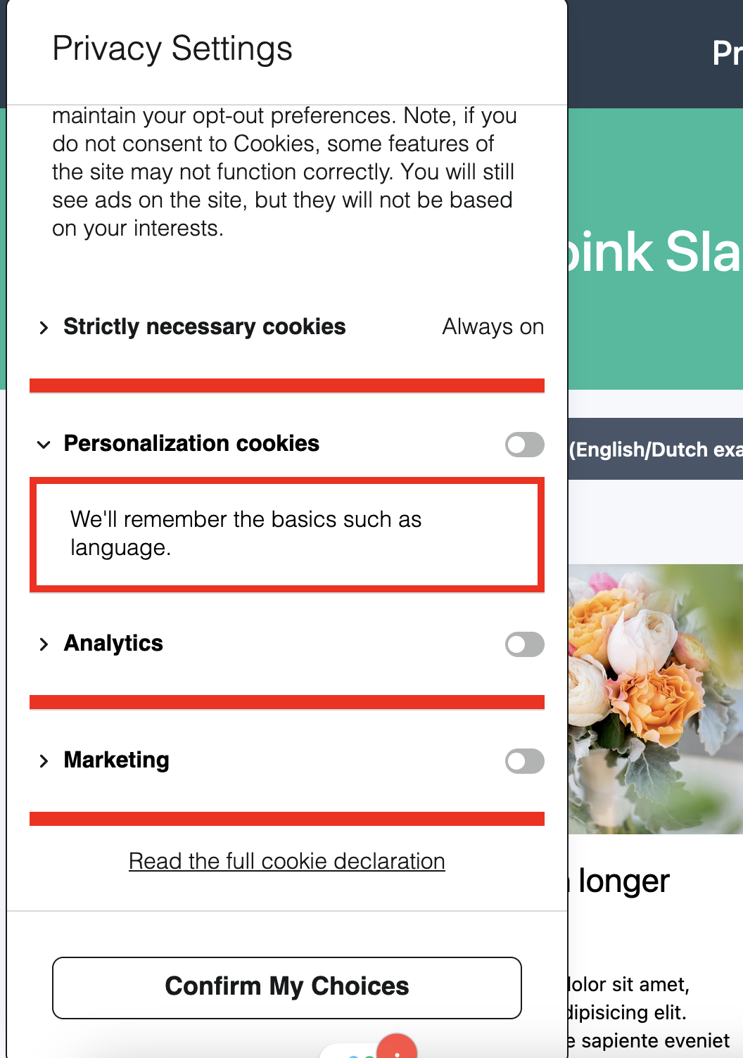
.dg-main-content-policy-option
.dg-main-content-policy-option is the container for each individual consent category.
:host(.dg-consent-banner) .dg-main-content-policy-option {
  border: red 5px solid !important;
}
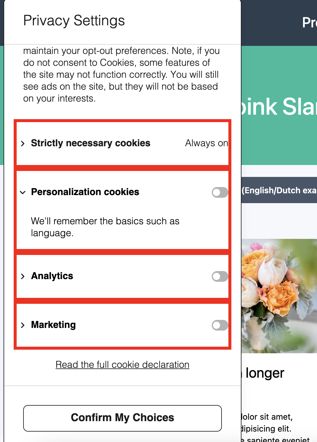
.dg-main-content-policy-option-heading
.dg-main-content-policy-option-heading is the container for the header portion of each consent category - not including the category description.
:host(.dg-consent-banner) .dg-main-content-policy-option-heading {
  border: red 5px solid !important;
}
.dg-main-content-policy-option-input
.dg-main-content-policy-option-input is the container for the input slider for each individual consent category. It also defines the clickable area for selecting the consent category.
:host(.dg-consent-banner) .dg-main-content-policy-option-input {
  border: red 5px solid !important;
}
.dg-main-content-policy-option-description
.dg-main-content-policy-option-description is the container for the descriptive text that can be exposed by expanding an individual consent category.
:host(.dg-consent-banner) .dg-main-content-policy-option-description {
  border: red 5px solid !important;
}
Rich Text Elements in Category Descriptions
Category descriptions support the same rich text formatting as body text assets. The following selectors target formatted content within expanded category descriptions:
| Selector | Element |
|---|---|
.dg-main-content-policy-option-description a | Hyperlinks |
.dg-main-content-policy-option-description b, .dg-main-content-policy-option-description strong | Bold text |
.dg-main-content-policy-option-description i, .dg-main-content-policy-option-description em | Italic text |
.dg-main-content-policy-option-description u | Underlined text |
.dg-main-content-policy-option-description p | Paragraphs |
.dg-main-content-policy-option-description ul | Unordered (bulleted) lists |
.dg-main-content-policy-option-description ol | Ordered (numbered) lists |
.dg-main-content-policy-option-description li | List items |
:host(.dg-consent-banner) .dg-main-content-policy-option-description a {
  color: blue !important;
}

:host(.dg-consent-banner) .dg-main-content-policy-option-description ul {
  list-style-type: square !important;
}
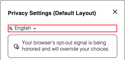
.dg-main-language-dropdown
.dg-main-language-dropdown is the container for the language selector dropdown. When the banner is configured with a single language, it displays a static label showing the current language. When multiple languages are configured, it renders a clickable dropdown that allows data subjects to switch between available languages. See Banner Localization for more details on configuring languages.
:host(.dg-consent-banner) .dg-main-language-dropdown {
  border: red 5px solid !important;
}
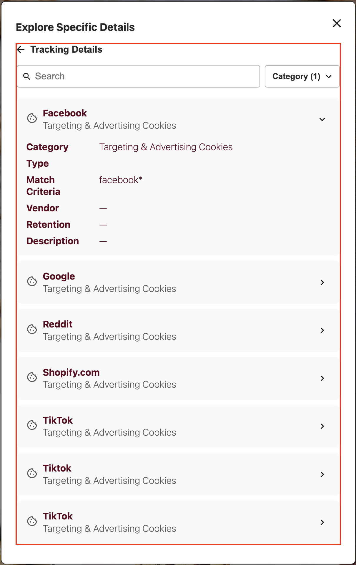
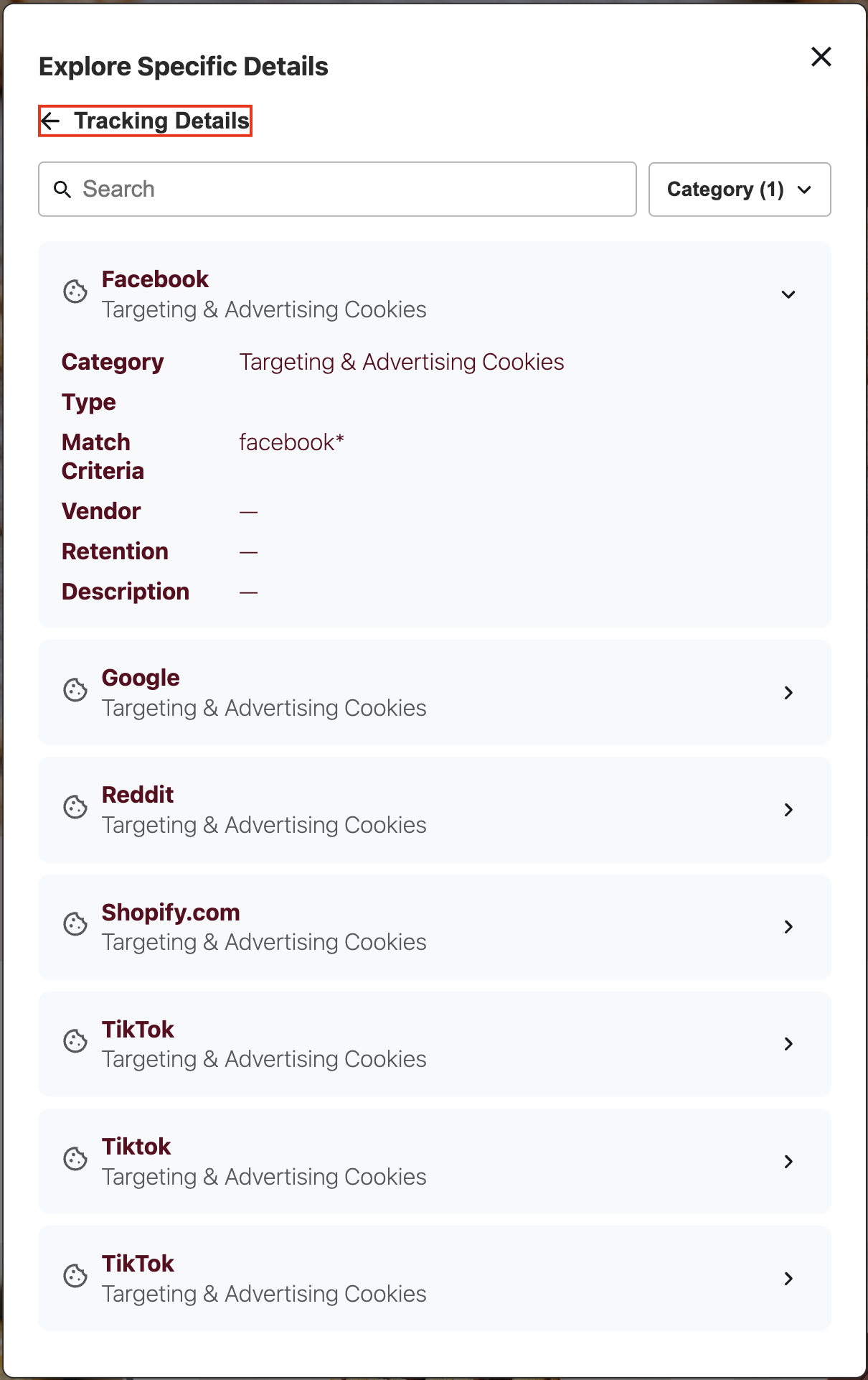
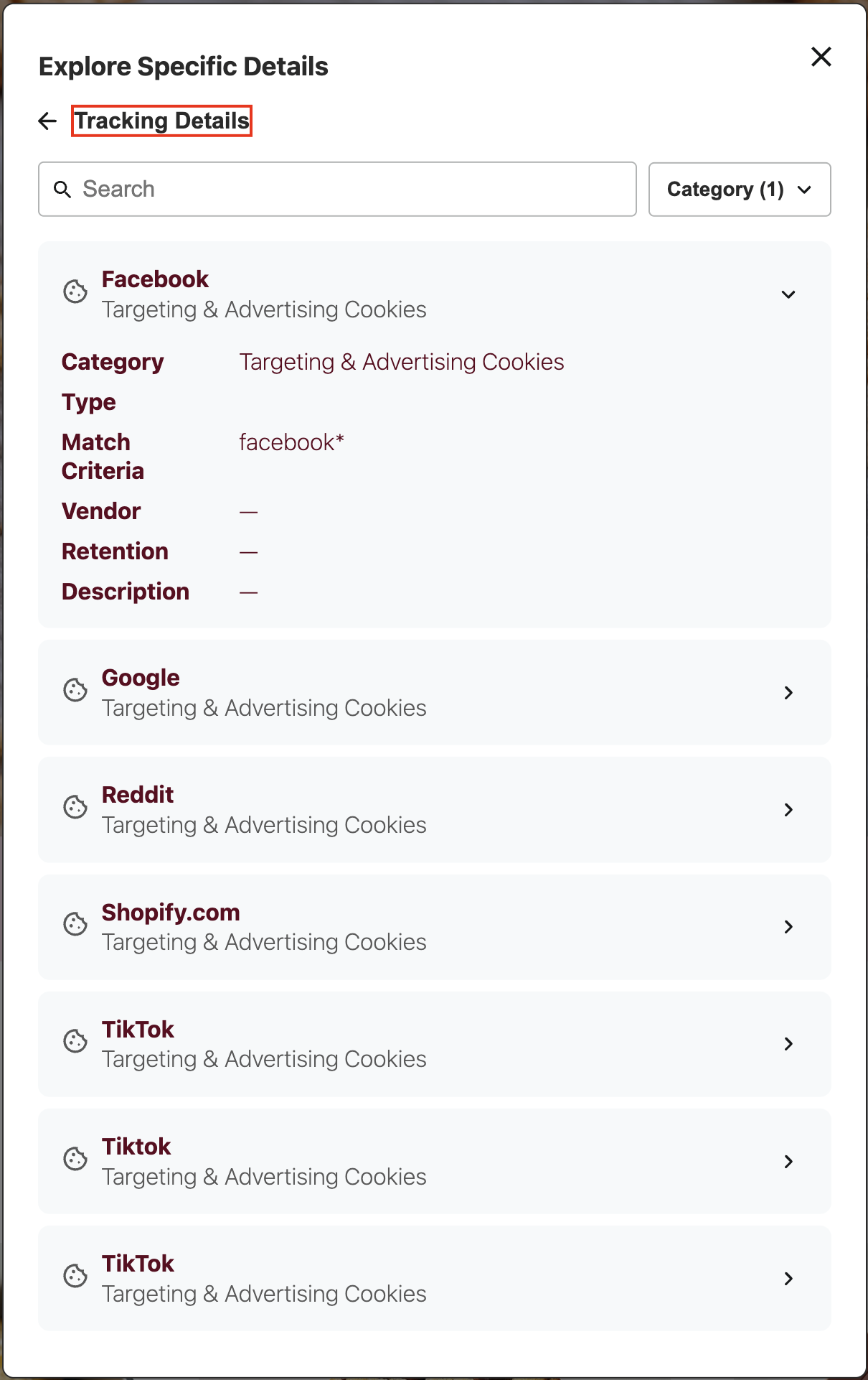
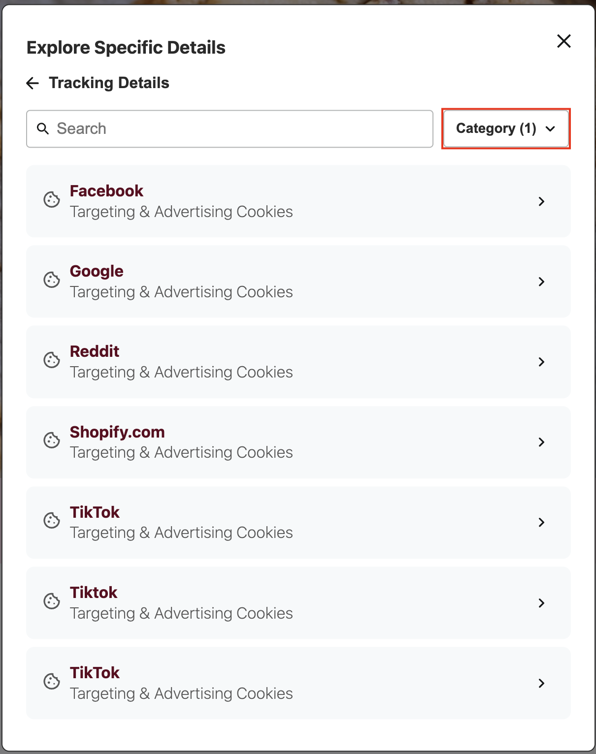
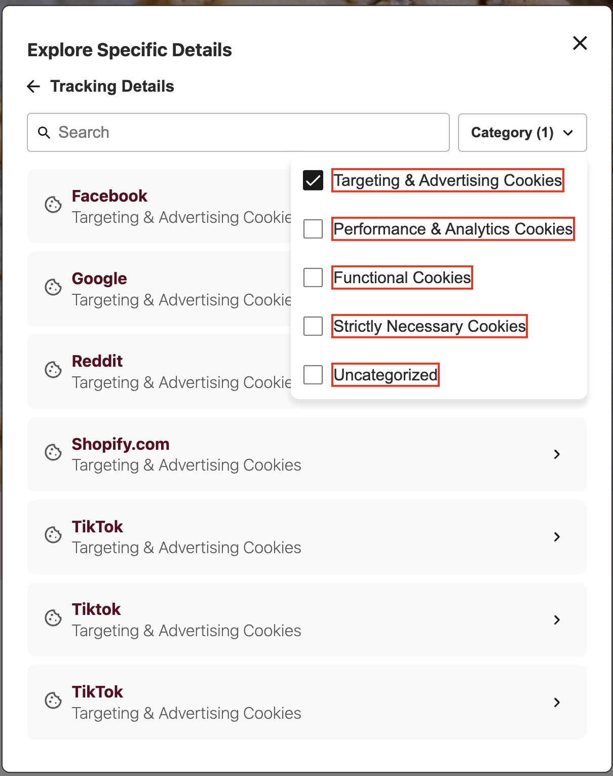
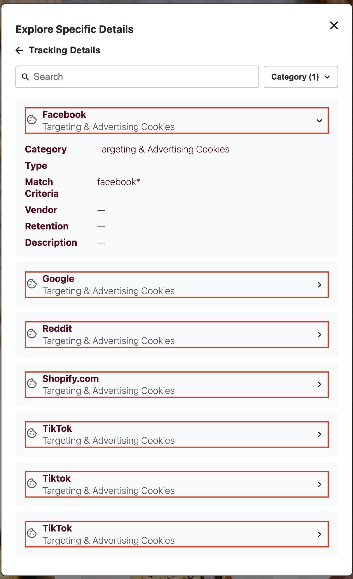
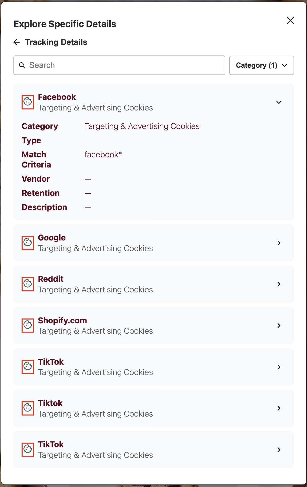
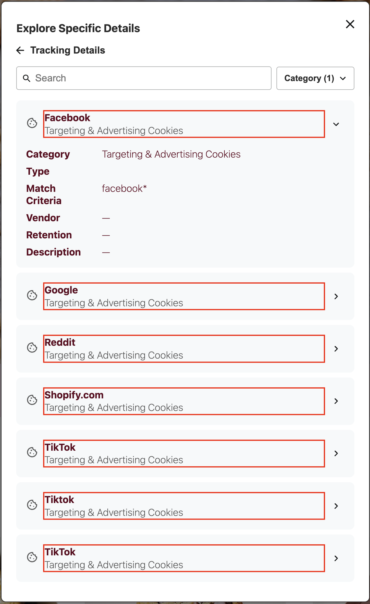
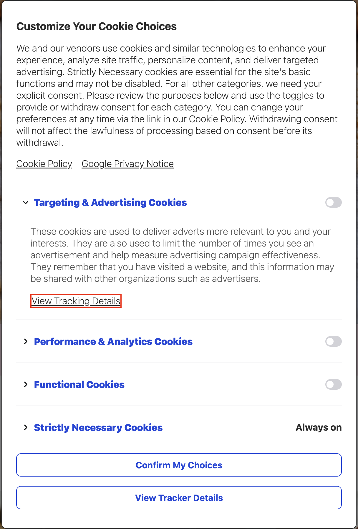
.dg-tracking-details
.dg-tracking-details is the main container for the tracking details view, which displays detailed information about tracking technologies and cookies.
:host(.dg-consent-banner) .dg-tracking-details {
  border: red 2px solid !important;
}
.dg-tracking-details-back-link
.dg-tracking-details-back-link is the container for the back navigation link that returns users to the previous view. If there is no previous view, the banner will close on click.
:host(.dg-consent-banner) .dg-tracking-details-back-link {
  border: red 2px solid !important;
}
.dg-tracking-details-back-link-text
.dg-tracking-details-back-link-text is the text element within the back navigation link.
:host(.dg-consent-banner) .dg-tracking-details-back-link-text {
  border: red 2px solid !important;
}
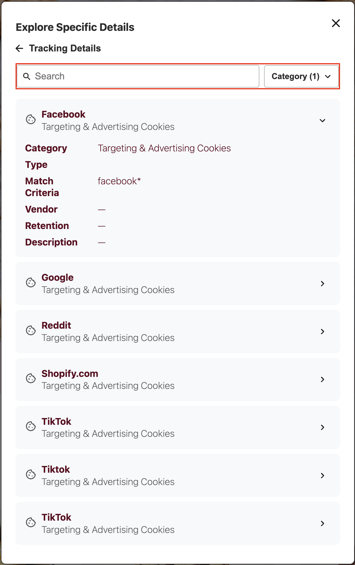
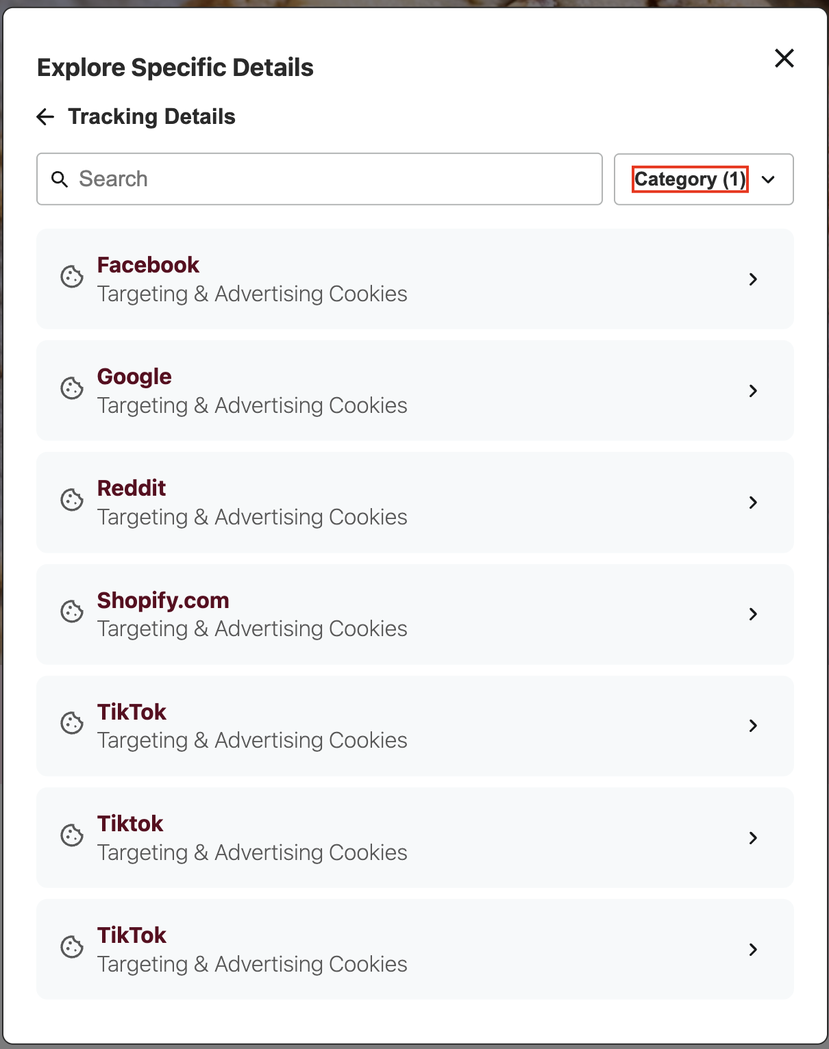
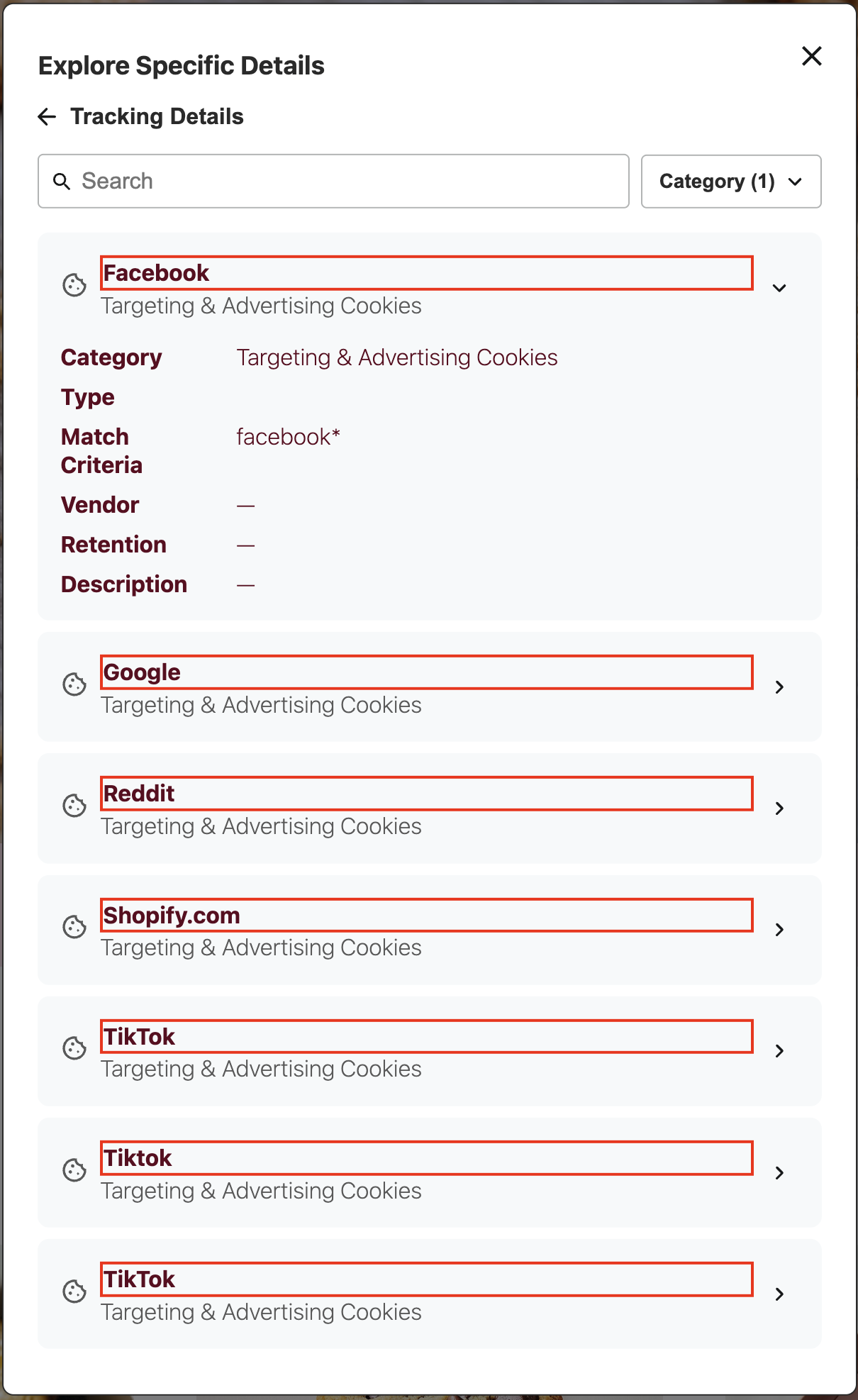
.dg-tracking-details-filters
.dg-tracking-details-filters is the container for the filtering controls, including search and category dropdown.
:host(.dg-consent-banner) .dg-tracking-details-filters {
  border: red 2px solid !important;
}
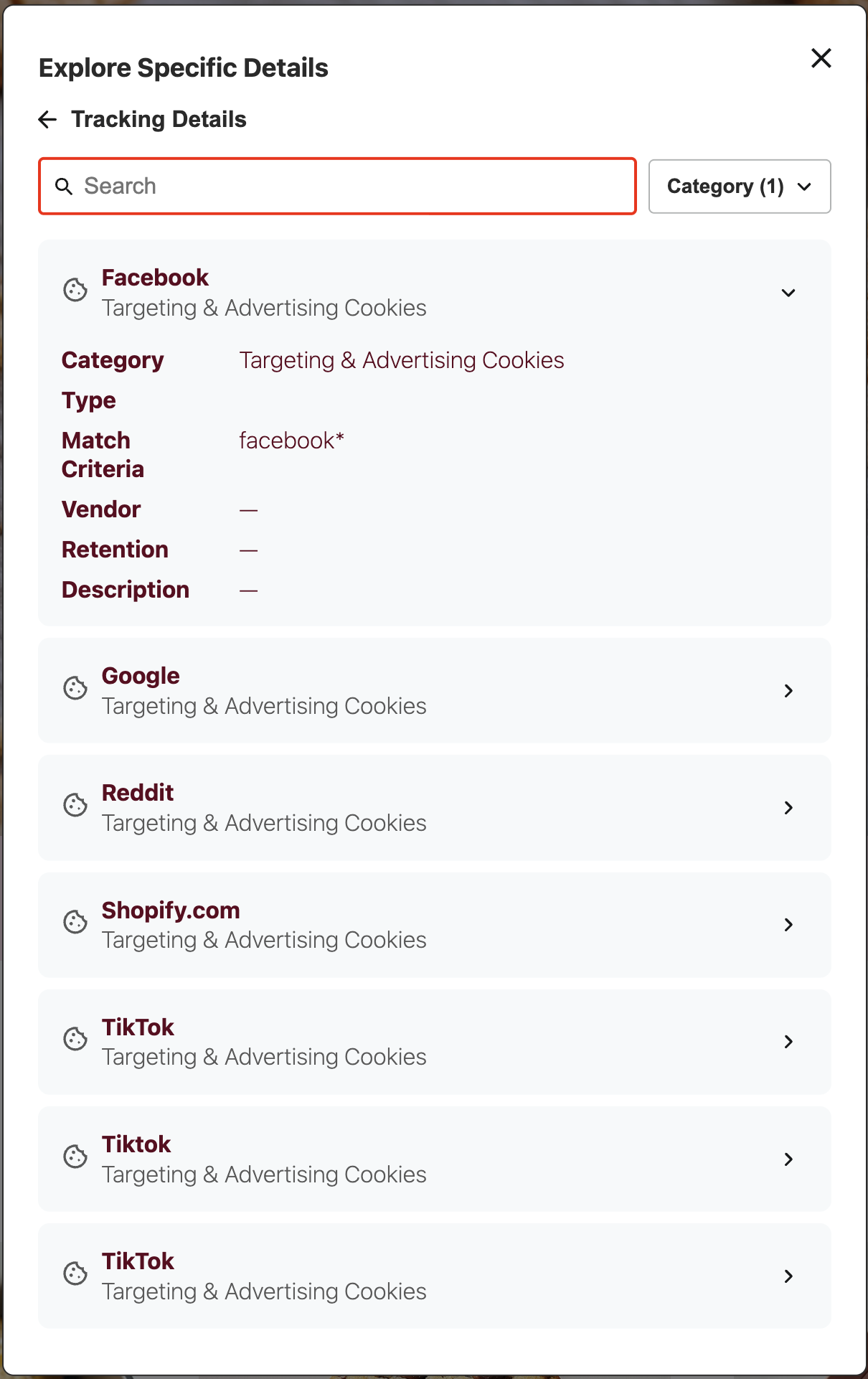
.dg-tracking-details-search
.dg-tracking-details-search is the container for the search functionality.
:host(.dg-consent-banner) .dg-tracking-details-search {
  border: red 2px solid !important;
}
.dg-tracking-details-search-input
.dg-tracking-details-search-input is the input field where users can search for specific tracking technologies.
:host(.dg-consent-banner) .dg-tracking-details-search-input {
  border: red 2px solid !important;
}
.dg-tracking-details-category-dropdown
.dg-tracking-details-category-dropdown is the dropdown selector for filtering tracking technologies by category.
:host(.dg-consent-banner) .dg-tracking-details-category-dropdown {
  border: red 2px solid !important;
}
.dg-tracking-details-category-dropdown-text
.dg-tracking-details-category-dropdown-text is the text element displaying the selected category within the dropdown.
:host(.dg-consent-banner) .dg-tracking-details-category-dropdown-text {
  border: red 2px solid !important;
}
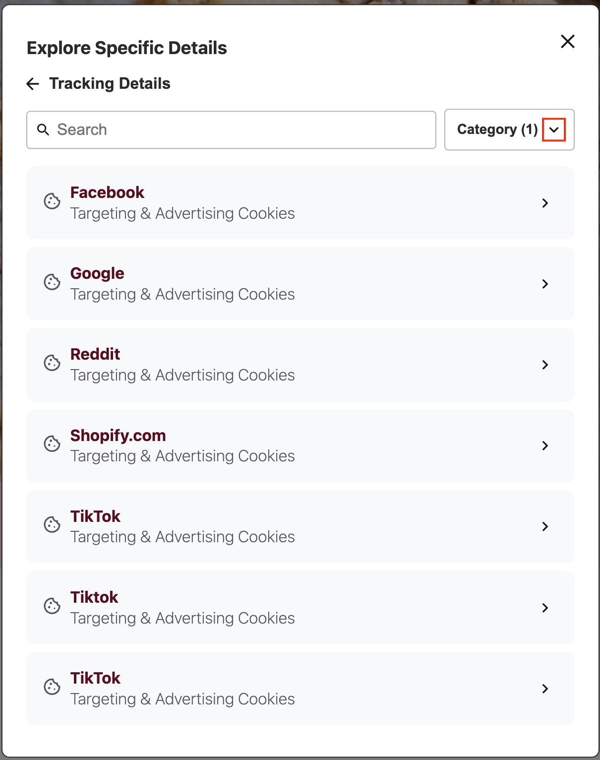
.dg-tracking-details-category-dropdown-icon
.dg-tracking-details-category-dropdown-icon is the icon element within the category dropdown.
:host(.dg-consent-banner) .dg-tracking-details-category-dropdown-icon {
  border: red 2px solid !important;
}
.dg-tracking-details-category-dropdown-menu
.dg-tracking-details-category-dropdown-menu is the menu container that appears when the category dropdown is opened.
:host(.dg-consent-banner) .dg-tracking-details-category-dropdown-menu {
  border: red 2px solid !important;
}
.dg-tracking-details-category-dropdown-menu-item
.dg-tracking-details-category-dropdown-menu-item is the container for each individual category option within the dropdown menu.
:host(.dg-consent-banner) .dg-tracking-details-category-dropdown-menu-item {
  border: red 2px solid !important;
}
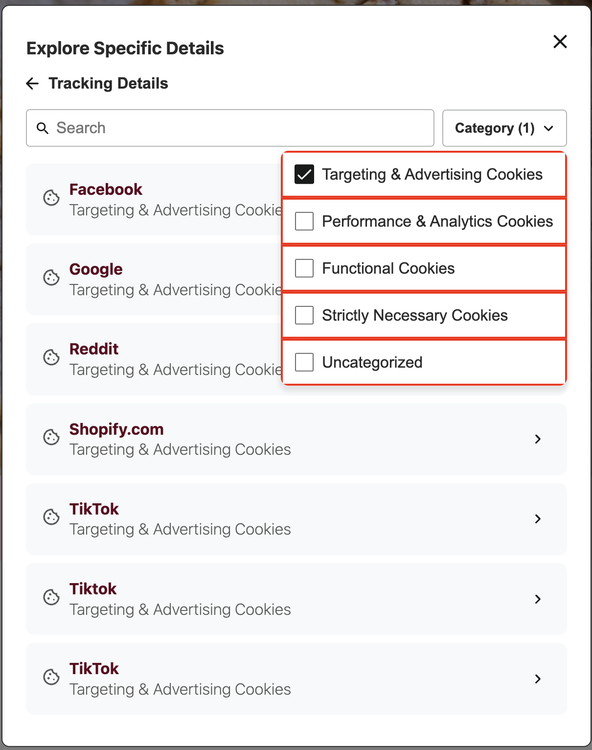
.dg-tracking-details-category-dropdown-menu-item-text
.dg-tracking-details-category-dropdown-menu-item-text is the text element for each category option in the dropdown menu.
:host(.dg-consent-banner)
  .dg-tracking-details-category-dropdown-menu-item-text {
  border: red 2px solid !important;
}
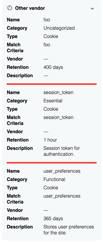
.dg-tracking-details-item
.dg-tracking-details-item is the container for each individual item in the list.
:host(.dg-consent-banner) .dg-tracking-details-item {
  border: red 2px solid !important;
}
.dg-tracking-details-item-header
.dg-tracking-details-item-header is the header section of each item, containing the icon, title, and subtitle.
:host(.dg-consent-banner) .dg-tracking-details-item-header {
  border: red 2px solid !important;
}
.dg-tracking-details-item-header-icon
.dg-tracking-details-item-header-icon is the icon displayed in the header of each item.
:host(.dg-consent-banner) .dg-tracking-details-item-header-icon {
  border: red 2px solid !important;
}
.dg-tracking-details-item-header-textContainer
.dg-tracking-details-item-header-textContainer is the container for the text elements within the item header, including title and subtitle.
:host(.dg-consent-banner) .dg-tracking-details-item-header-textContainer {
  border: red 2px solid !important;
}
.dg-tracking-details-item-header-title
.dg-tracking-details-item-header-title is the title text element for each item, typically displaying the vendor name.
:host(.dg-consent-banner) .dg-tracking-details-item-header-title {
  border: red 2px solid !important;
}
.dg-tracking-details-item-header-subtitle
.dg-tracking-details-item-header-subtitle is the subtitle text element for each item, displaying the category type.
:host(.dg-consent-banner) .dg-tracking-details-item-header-subtitle {
  border: red 2px solid !important;
}
.dg-tracking-details-item-collapsible
.dg-tracking-details-item-collapsible is the expandable section containing detailed information about the tracking technology.
:host(.dg-consent-banner) .dg-tracking-details-item-collapsible {
  border: red 2px solid !important;
}
.dg-tracking-details-item-collapsible-label
.dg-tracking-details-item-collapsible-label is the label element for each field within the collapsible details section.
:host(.dg-consent-banner) .dg-tracking-details-item-collapsible-label {
  border: red 2px solid !important;
}
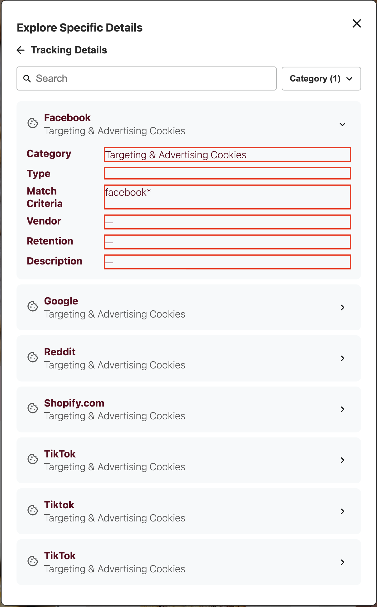
.dg-tracking-details-item-collapsible-value
.dg-tracking-details-item-collapsible-value is the value element for each field within the collapsible details section.
:host(.dg-consent-banner) .dg-tracking-details-item-collapsible-value {
  border: red 2px solid !important;
}
.dg-main-content-policy-option-tracking-details-link
.dg-main-content-policy-option-tracking-details-link is the link within a consent category that opens the tracking details view.
:host(.dg-consent-banner) .dg-main-content-policy-option-tracking-details-link {
  border: red 2px solid !important;
}
.dg-tracking-details-item-separator
.dg-tracking-details-item-separator is the horizontal line separating multiple tracking items.
:host(.dg-consent-banner) .dg-tracking-details-item-separator {
  border: red 2px solid !important;
}
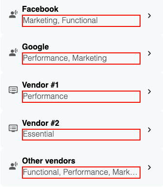
.dg-tracking-details-categories
.dg-tracking-details-categories is the category list with ellipsis truncation for tracking details group headers.
:host(.dg-consent-banner) .dg-tracking-details-categories {
  border: red 2px solid !important;
}
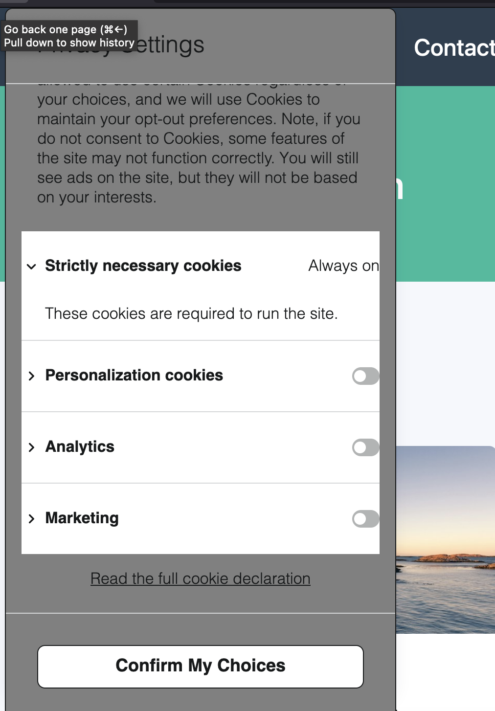
Advanced Modifications
The intention of this section is to offer a few common modifications that might be desirable for restructuring the Consent Banner. This is not intended to be an inclusive list of possible modifications, and will not replace understanding of CSS.
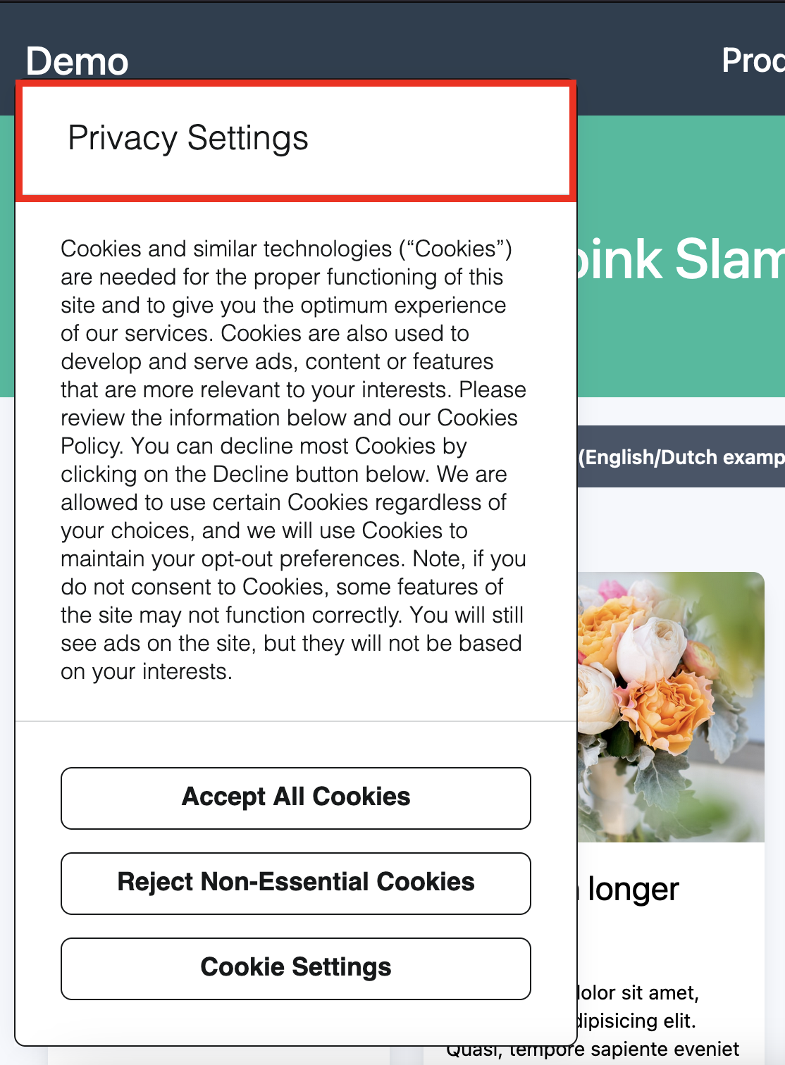
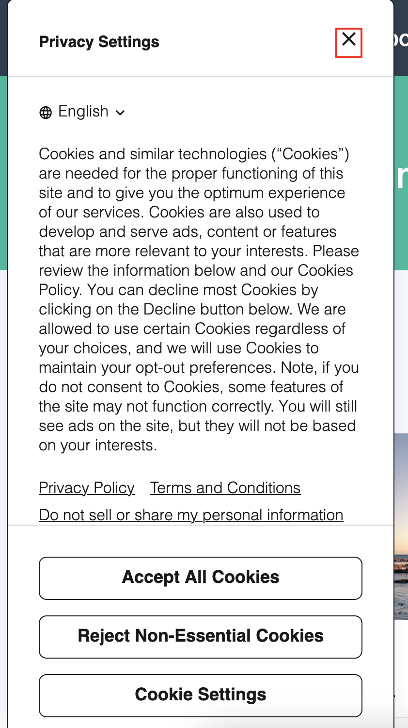
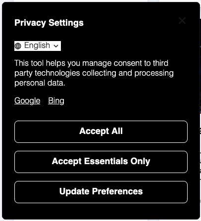
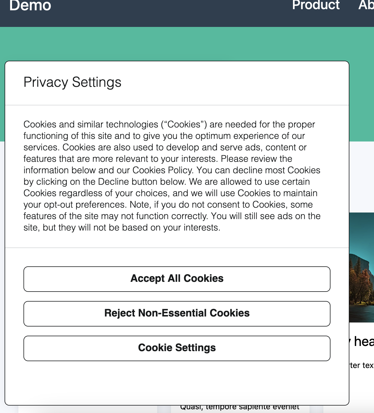
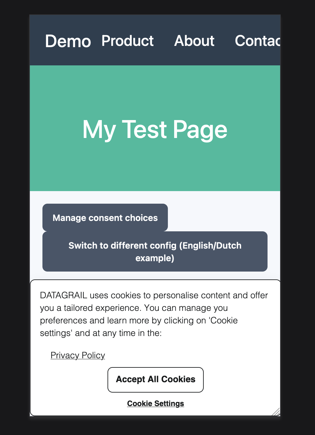
To illustrate the changes necessary to perform certain actions, we provide an example of what the Consent Banner looks like unedited.
Dark Mode
A common modification is adding a dark mode option to the banner. Here's some sample code as a baseline:
<style id="dg-consent-custom-style">
   :host(.dg-consent-banner) {
      .dg-app, .dg-app *, .dg-button, .dg-link, .dg-main-content-explanation {
         background: black;
         color: white;
      }

      .dg-button {
         border: 1px solid white;
      }

      .dg-app svg, .dg-app svg * {
         fill: white;
         stroke: white;
      }
   }
</style>
Banner Size
By manipulating the selector .dg-app we can override the dimensions of the Consent Banner.
This will have major ramifications for sizing in all forms. Be sure to thoroughly test this new customized view.
:host(.dg-consent-banner) .dg-app {
  width: 600px !important;
  height: 400px !important;
}
Responsive Design
We use Media Queries to make the banner responsive at a variety of different screen sizes. The breakpoints we have are:
@media only screen and (max-width: 350px) and (min-width: 1px)@media only screen and (max-width: 480px) and (min-width: 351px)@media only screen and (max-width: 768px) and (min-width: 481px)@media only screen and (max-height: 600px)
Using media queries, you can customize and resize the banner at different screen sizes.
@media only screen and (width <=480px) and (width >=351px) {
  :host(.dg-consent-banner),
  :host(.dg-consent-banner.dg-right) {
    top: unset !important;
    width: 100%;
    max-height: unset;
  }

  :host(.dg-consent-banner) .dg-header,
  :host(.dg-consent-banner) .essential_only {
    display: none;
  }

  :host(.dg-consent-banner) .dg-main-content-explanation,
  :host(.dg-consent-banner) .dg-link,
  :host(.dg-consent-banner) .dg-button,
  :host(.dg-consent-banner) .dg-main-content-policy-option-heading,
  :host(.dg-consent-banner) .dg-main-content-policy-option-input,
  :host(.dg-consent-banner) .dg-main-content-policy-option-description {
    font-size: 14px;
  }
  :host(.dg-consent-banner) .dg-links {
    padding: 0 32px 0px;
  }

  :host(.dg-consent-banner) .dg-main-content-policy-option-heading {
    height: 30px;
  }

  :host(.dg-consent-banner) .dg-main-content-explanation {
    padding: 15px;
  }

  :host(.dg-consent-banner) .dg-button {
    width: fit-content;
  }
}
Custom Logo
You can add a custom logo to your consent banner by using CSS to inject an image before the banner title. The logo will appear inline with the title text.
:host(.dg-consent-banner) .dg-text-title::before {
    content: url(https://yourlogo.svg);
    display: inline-block;
}
Disclaimer: The information contained in this message does not constitute as legal advice. We would advise seeking professional counsel before acting on or interpreting any material.